Confessions of a New Wave Cartoonist
29 years ago, more or less, a collection of strips from my weekly feature Bad Habits was published, to the world's general indifference.¹ I was a “New Wave” cartoonist, though I didn’t know it at the time. In fact, I didn’t realize this until 2010, when NEWAVE! The Underground Mini Comix of the 1980s (Fantagraphics Books, 2010)² was published, and my work was in it. In retrospect, however, it should have been painfully obvious. How could I have missed the warning signs?
Published during the early '80s
"Ironic" art style
"Snarky" attitude
No set format or characters, just a personal "take" on life
Published in "Alternative" weeklies
Brutal over-use of "scare quotes"
More than a New Wave cartoonist, however, I was an alternative cartoonist, part of a comics cohort that straddled the divide between syndicated daily comics and the Underground comix of the '60s and '70s.
Alternative To What?
The alternative city paper movement officially began in 1955 at The Village Voice, but it really got rolling in 1971 with the founding of The Chicago Reader. The Reader provided the template: a free weekly (revenue from classified ads paid the bills) that would be fiercely local, iconoclastic, and aggressively youth-oriented. Soon every good-sized city and college town had its' own Reader or New Times or City Paper, or in the case of Oakland CA, the East Bay Express. They were hungry for locally-created material to distinguish themselves from the "mainstream media", something fresh, bold, original, and most of all, cheap. One thing that ticked all those boxes was comics. Many leading lights of the alternative comics movement got their start in the pages of these papers, including Matt Groening, Lynda Barry, Tom Tomorrow, Reuben Bolling, Mark Akan Stamaty, Alison Bechdel and Chris Ware, and others.
The Early Years
In 1979 I had just moved to San Francisco from Ithaca, NY. An aspiring illustrator, I'd already done my first professional work for the local weekly Ithaca New Times and a small ad agency, and was eager to test myself in a bigger pond. Illustration work proved hard to find in the Big City, however. I felt lucky to get a few assignments at Swing magazine, a Playboy wanna-be that had a unique niche in the "Mens" magazine category — photos of nude women with large breasts.
Which might seem like an obvious angle, indeed the bare minimum (so to speak) required of the genre. But Swing specialized in really, really, really big breasts, freakishly big. These were monstrous udders, tenuously attached to women with names like Titanic Tina and Chesty Morgan, whose terrifying overabundance of "busty substances" (as Peter Cook would put it) forced you to wonder how these poor women got through life in their condition. How do they exercise, or even walk upright without help? Where do they shop for clothes?
Swing was owned and edited by one Arv Miller, who began his long, fruitful association with bosoms as Art Director of the very first issue of Playboy, before striking out on his own. That was back in Chicago during the '50s, however, and by 1980 he was in a tiny, cluttered office in San Bruno dealing with the likes of me. If Playboy was king of the mens' magazine realm, Swing was the creepy uncle.
If Arv was embittered by this reversal of fortunes he never showed it, at least to me. He seemed to take an almost paternal pleasure in explaining the mechanics of the magazine biz, and why it was important to distinguish yourself in the marketplace with a USP (Unique Selling Proposition) — like, say, humungous knockers. With only a few slots available on the retail shelf for any given magazine niche, he reasoned, you had to distinguish yourself.
While photos of mountainous teats and the women who bore them was its raison d'être, the articles that appeared in Swing also played a vital role in the whole marketing equation. They were the "beard", the protective camouflage required to prove that it was not merely about photos of naked women. A periodical lacking such amenities as general interest articles would be porn, unfit to grace the newsstands of 7-11.
And a proper magazine article must have an illustration, of course. A lot of local cartoonists did work for Swing, including Spain Rodriguez, whom Arv praised for his considerable skill at drawing hugely endowed women. Because whatever the topic of the article, the illustration had to somehow include at least one woman with the requisite gargantuan chest, preferably nude. It was a conceptual challenge, and I struggled with it. Arv's only art direction for everything I submitted was simple: bigger tits! Because they literally couldn't be too big.
Though the money was inconsiderable, Arv always paid on delivery of the final art, and immediately offered a new assignment, pulling a manuscript more-or-less at random from his huge backlog of never-to-be-read stories. It was work, but there was no dignity or future in it. Right around then I decided to try cartooning.
Illustrators must wait for a whole series of decisions to be made before they get to work, and afterward have nothing but a pittance to show for it. As a cartoonist I could assign myself work, sell rights to it, and own all future uses of it. I would call the shots! True, I'd never before written comics, or anything really, but how hard could that be? To make this scheme work, however, I was going to need a USP.
Why Norman Dog?
Adopting the name Norman Dog was all about branding. Larrett, my actual surname, has always been inexplicably hard for most people to grasp. Nobody every seems to spell it right. I've seen every variant on it imaginable, and many not. It's often spelled Larrette or Larretti, because people think there should be an e or i on the end. I get Larriat, Larue, Laprett, LaRat, and Laurant. Sometimes the L is mistaken for G or a C an it becomes Garrett or Carrett. Even the East Bay Express for years mailed my contributor copies to "Raymond Garrett". The idea of my name being so easy to mangle struck me as just bad marketing. I needed a name that was easy to spell and pronounce, hard to forget. I got Norman Dog. It worked pretty much as planned, though a Google search still gets more hits for something called "Norman the Dog", which is evidently an actual dog.
The first cartoon to appear under the byline of Norman Dog was Plato The Lovable Klown, published in 1981 by Boulevards, a long-defunct San Francisco monthly. That strip only ran twice, but on the strength of those two comics I was hired to create a weekly feature for the East Bay Express. Not only that, but I was allotted an entire half-page — right on page 2! (The first time I met Matt Groening at a comics convention, he expressed wonderment at how I got such tremendous placement).
It was a huge amount of space to fill up each week, and I already had a full-time job as a t-shirt designer. My drawing, which was then fairly labor-intensive, needed to be much more simple and direct if I was going to keep up.
Looking Sharp
I decided to base my graphic forms on perfect circles, squares and triangles, rather than ovals, the traditional building blocks for cartoon art. This immediately gave everything a pleasingly modern, hard-edged look. Also, it meant I could use drawing templates, die-cut plastic or metal sheets that created perfectly machined shapes. That sure sped things up! Slap on some Zip-A-Tone™³ for that "Pop Art" look and there you are. The simpler the drawing got the better it looked to me. It was stripped-down, proudly artificial, anarchic yet tightly controlled. Fast, cheap and full of attitude. It was New Wave!
Writing Is Easy, Lettering Is Hard
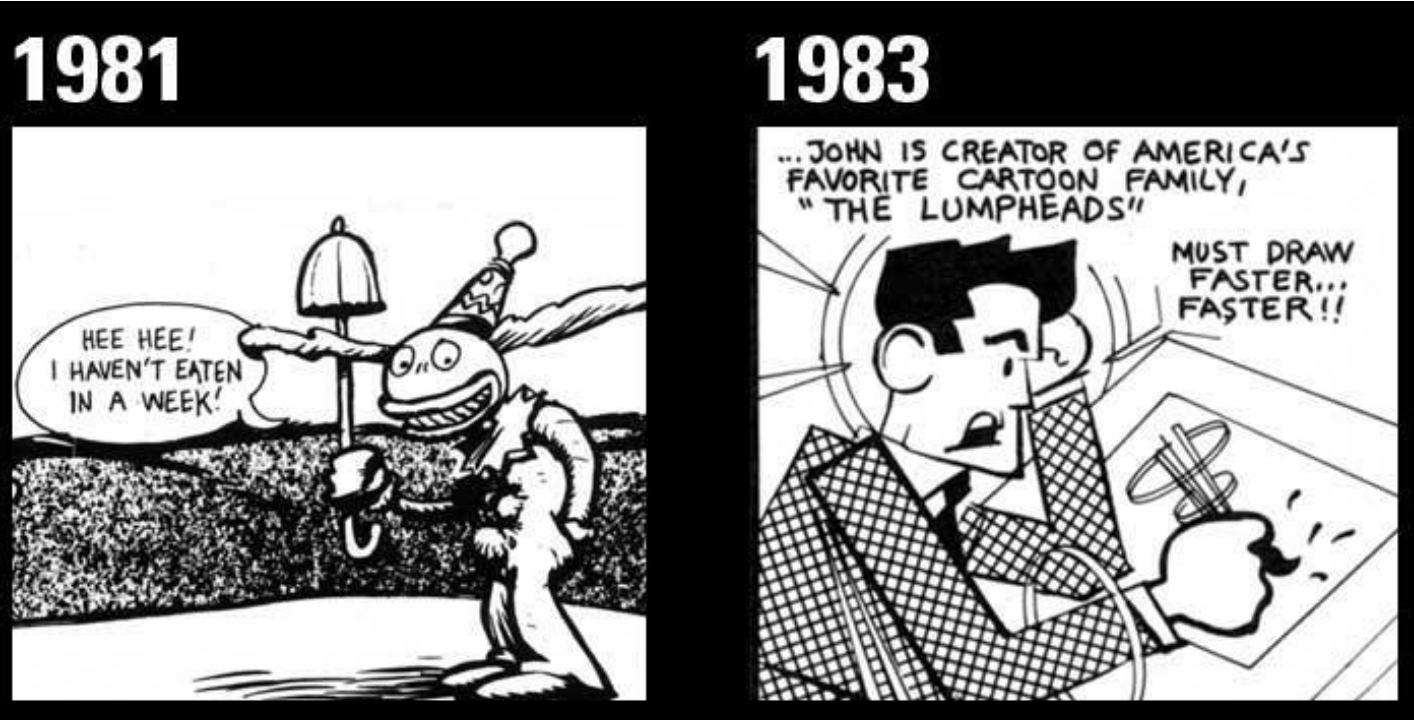
Unlike boring, conventional, popular cartoonists I did't have a regular cast of characters, setting or theme. I needed a whole new concept each week, which encouraged, even demanded, improvisation. One early morning I spilled ink all over my half-finished page, hours before the strip was due, and rather than start over I just worked it in (that one’s in this book).
Eventually I devised a formula to get a 12-panel strip done in exactly 3 hours. The trick was to break it down to a series of discrete tasks, and allot exactly 10 minutes to draw, ink, and letter & erase the pencil lines from each panel. (i.e., 5 min. drawing + 5 min. inking + 5 min. finishing = 15 min. per panel x 12 = 3 hrs.) Whatever the result, that was the strip.
Though often as not I would take the opposite approach, obsessively re-working and tweaking until forced to turn it in. Whatever method or technique I used, there seemed to be little difference in the outcomes. Good or bad, this was the only kind of cartoon I could do.
Like most of the alternative cartoon crowd, I lacked the passionate anti-establishment anger of the Underground cartoonists. I wasn't mad at society, or injustice, or anything really, which made my work pretty tame as social commentary. It was more like an SNL sketch, poking mild fun at cliches and media conventions. Mostly, I just needed to write something so I could then draw the pictures.
Lettering is the one aspect of cartooning I truly hated. Guidelines had to be ruled in with a lettering guide, the text penciled in, then inked with a special lettering pen. Often I'd finish to discover a misspelled or omitted word, which meant I had to brush white paint over the mistake and re-letter the now-lumpy surface. Nobody was happier than I when computerized fonts made this obsolete.
The Golden Age Of Dog
At the peak of its renown, Bad Habits appeared in a handful of weeklies, including the Chicago Reader, San Diego City Paper, Washington City Paper, Baltimore City Paper, Phoenix New Times, The Stranger, as well as the Express. Spin Magazine reprinted them for a year or so, and a few ever appeared in RAW, which was a thrill. A handful of strips were printed in Weirdo, and Robert Crumb sent me a postcard with kind words about my work. I think I spilled coffee on it, though:

Many things changed over the strip’s course. I experimented with different formats and techniques. Desktop publishing tools evolved to where I could do my work on a computer, and I haven’t touched, much less spilled, ink in many years. The half-page space gradually shrank, disappearing for good in 2009, when the plug was finally pulled on Bad Habits. Hard times hit the newspaper business, the classified ad money having fled to Craigslist. Comics became less important to the identity of papers and migrated from the front to the rear, back among the escort service ads — if they run at all. The comics that still appear in the weeklies are mostly syndicated features by established names. It’s not a place to break in anymore.
Perhaps it’s best to see these cartoons as a tiny, cracked window into a strange, profligate era in America, or my America anyway, a time when Reagan stalked the land and the Taliban was our ally, MTV was starting and the USSR was ending, the cocaine flowed like Coca-Cola™ (or so I am told), newspapers could still afford to run cartoons, and it seemed like anyone with a pen, ink, and a crazy dream could have their own comic strip.
Raymond Larrett, AKA Norman Dog
San Francisco, 2011
The first edition of Bad Habits was self-published in 1983, in an edition of 500. These books were spiral bound, because I could do it myself to keep the production cost down. That book attracted enough attention and sales to interest Last Gasp, the venerable underground comix publisher, who published another edition in 1984. The Last Gasp book retained the spiral binding, a format that proved unpopular with bookstores, who had trouble displaying them spine-out on the shelves. Which may be why three decades later Last Gasp still has copies around.
Though a fine book, my presence in it is something of a mistake. The book is meant as an overview of the mini-comics scene, something I really had nothing to do with. It just so happens that Dale Luciano asked me if. he could reprint a few of my weekly strips in his Dada Gumbo mini comic, and I agreed. That is the full extent of my mini comix experience. Sorry, mini-comix artists who should have been in it instead of me!
Look it up, kids.